Friday Digital Roundup
The Friday Digital Roundup is a witty take on the weird world of the internet. With fun stories from around the globe, it’s the only email newsletter you’ll actually read and enjoy!
We do love writing it, but clearly not as much as people like receiving it - just look at the response we got when a technical hitch meant it wasn’t sent out on time!
@Spaghetti_Jo
Coffee and the FDR is how I start my Friday.
Do not engage until I have devoured both
When it comes to the end of the week, there is no better way to start a Friday than with a run around the internet with Todd and Jo in the FDR. Just don't let them know I do it from the loo!
@Spaghetti_Jo
My inbox is full of rubbish newsletters that Im constantly deleting😬 My VIP inbox is for 1 thing only- THE DIGITAL ROUNDUP🤠I dont read a Newspaper or the news online, I just wait for Fridays, when this lands in my inbox- then I know ‘The weekend has landed’🤗
Get the Friday Digital Roundup and see what everyone’s talking about.
We may look like cowboys, but we’ll never abuse your data! Find out what we’ll do with it here, partner.
Spaghetti Blog
Design for Business – Part 1: How Good Design Can Boost Your Business
This week we have a guest post from Michelle Abrahall.
Michelle is a local designer and she’s going to be sharing her insight and tips with us over the next few weeks. This is a four part series and hopefully they’ll form a great collection for you to better understand what makes great design, why you need it, and how to find a good designer.
Feel free to ask questions in the comments and Michelle will do her best to answer them. This week it’s all about boosting your business.
Over to you Michelle…

Design for Business – Part 1: How Good Design Can Boost Your Business
As a freelance graphic designer, I’ve worked with businesses across the spectrum, from established corporations to start-ups and SMEs. But I’ve found there’s still misconception that buying design is something that only the big boys can afford.
Too often, business owners are missing out on the value that good design can add, because they think it’s out of their reach or they don’t feel confident in hiring a creative (I know, we can be an intimidating lot…).
So I’m going to present a view from the other side of the fence and help you maximise the benefits of design.
Let’s be honest; a lot of it is simply making your company’s visual presence as appealing as possible.
Looks matter. We are a shallow lot, us humans, especially when it comes to deciding which brand gets our hard-earned cash.
How many of us have clicked on a website to buy something and have been immediately put off by an outdated, slow-loading homepage? Or cringed at an advert using a cheesy stock photo of businessmen shaking hands or laughing at a filing cabinet?
But I’m getting ahead of myself; let’s start with some basics.
Here are 5 essential things you need to know about design for business
#1: Personality matters
Before you can successfully commission any design, you need to really know your company’s personality. Is it serious? Playful? Traditional? Progressive? It’s vital that the design you use to sell your business fits with its personality, or your customers will end up confused. A simplistic example would be a lawyer using the Comic Sans font on a business card – it just doesn’t fit!
#2: Consistency is key
You might have come across the term ‘brand guidelines’ or ‘brand identity style guide’. This is basically a set of instructions that ensures any creative output for that company follows certain rules. This might include using a certain colour palette, particular fonts, and different versions of the logo for different applications. Consistency in design instantly makes your business look bigger, better, and more professional. It shows your customers that you pay attention to detail.
#3: Don’t be afraid of change
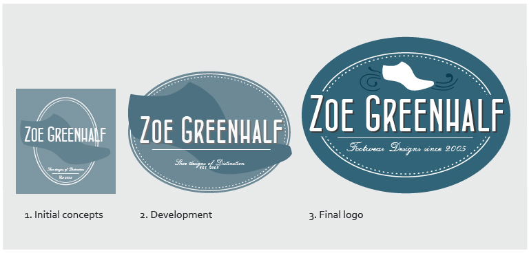
Established businesses sometimes stick with a tired old logo or branding just because they believe it speaks of heritage and quality. Change, when done for the right reasons, is good. Look at brands like Coca Cola and Shell, always tweaking and updating their logos. Refreshing your logo, website or shop signage sends the message that you’re always striving to improve and modernise.
#4: Beware of sloppiness
When it comes to releasing design that represent your business into the world, I never want to hear you utter the words ‘that will do’. Don’t be that business that has a fuzzy logo on its website or a photo that’s been squashed or stretched on their newsletter. It looks lazy and unprofessional and will get you remembered for the wrong reasons.
#5: Don’t forget the words!
Good visuals are half the battle, but you also need quality copy. Many businesses write their own copy for their websites or corporate literature because they think ‘no one knows my business better than me’. And that’s precisely the problem. They’re not impartial and often assume customers know more than they actually do. Some designers (myself included) also offer copywriting services, and some will refer you to a colleague. Advertising and marketing agencies often have in-house copywriters.

So that’s the basics dealt with. I hope you’ve found them useful. Next time we’ll look at how to find a good designer and how to get the best out of your working relationship with them.
Please do ask your questions below in the comments. I love hearing about business and design.
Tags associated with this article
Post a comment
We'd love to know what you think - please leave a comment!


0 comments on this article