Friday Digital Roundup
The Friday Digital Roundup is a witty take on the weird world of the internet. With fun stories from around the globe, it’s the only email newsletter you’ll actually read and enjoy!
We do love writing it, but clearly not as much as people like receiving it - just look at the response we got when a technical hitch meant it wasn’t sent out on time!
@Spaghetti_Jo
Coffee and the FDR is how I start my Friday.
Do not engage until I have devoured both
When it comes to the end of the week, there is no better way to start a Friday than with a run around the internet with Todd and Jo in the FDR. Just don't let them know I do it from the loo!
@Spaghetti_Jo
My inbox is full of rubbish newsletters that Im constantly deleting😬 My VIP inbox is for 1 thing only- THE DIGITAL ROUNDUP🤠I dont read a Newspaper or the news online, I just wait for Fridays, when this lands in my inbox- then I know ‘The weekend has landed’🤗
Get the Friday Digital Roundup and see what everyone’s talking about.
We may look like cowboys, but we’ll never abuse your data! Find out what we’ll do with it here, partner.
Spaghetti Blog
Which Pages Does My Website Actually Need?
When planning a website, the first question that often springs to mind is: which pages will my website need?
It’s an important question because it impacts the entire development of your website. You’ll have to account for page content, design, graphics, user experience, and a load of other stuff that you may not have thought of yet.
So, we want to help. That’s why we’ve put together the 10 pages you absolutely need for your website and explained why each one matters.
Which Pages Does My Website Actually Need?
Homepage – first impressions count
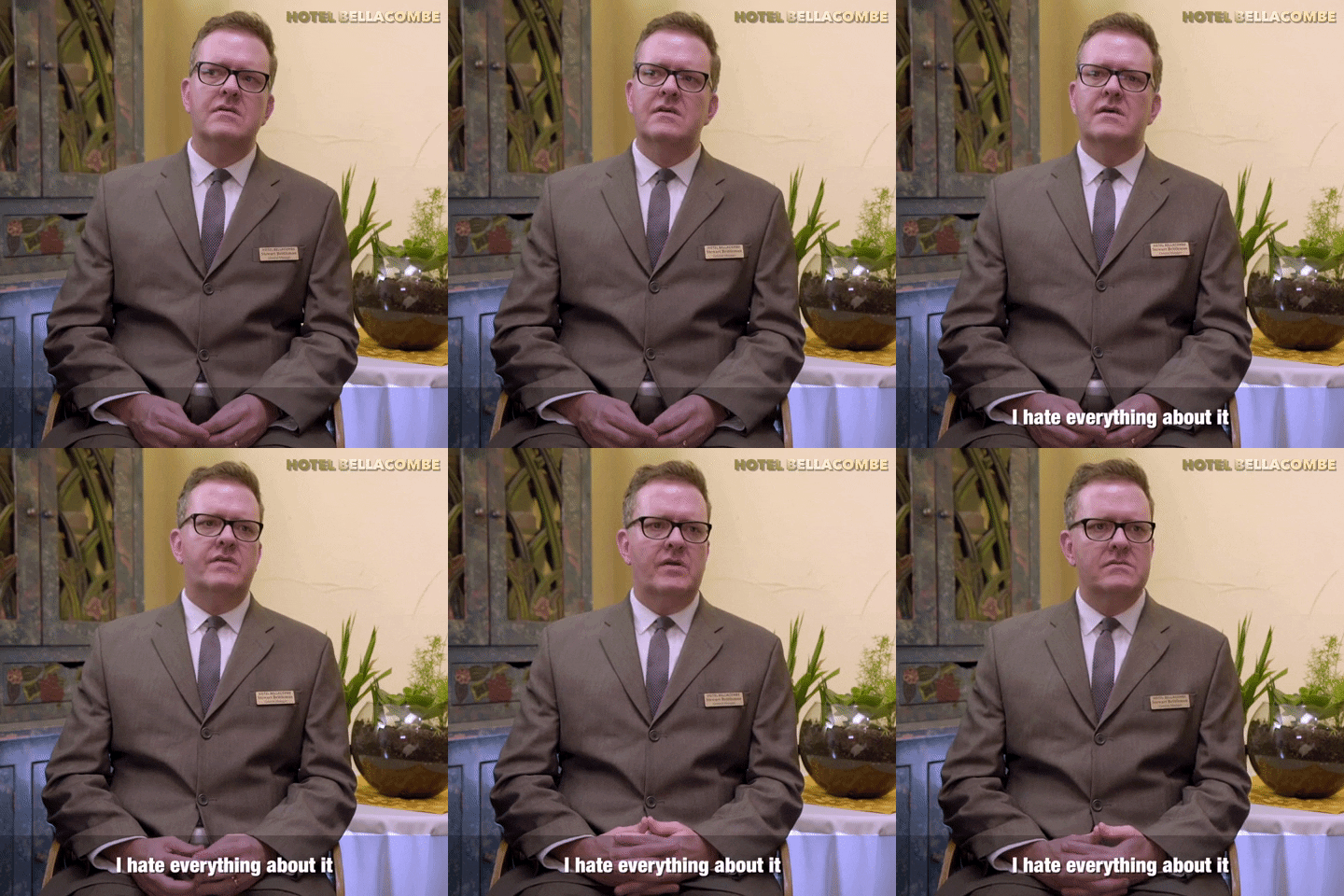
First impressions are super-duper important for your website.
It takes just 2.6 seconds for a visitor’s eyes to lock into the area of the page that most influences their first impression. Then, you have just 50 milliseconds until a user forms an opinion that determines whether or not they’ll stay on your website. Also, even though we’re content writers, we’re happy to admit that 94% of first impressions are design-related so your layout needs to be clean and understandable.
When a visitor gets to your website’s homepage, they may have already spent time on your competitors’ websites. Think of it like mug shopping; you’ll look at one mug but then look at the one next to it, because the design is prettier and essentially stands out.
That’s exactly what your website should do: stand out. There are a lot of mugs out there in the wild west, so you need to give some thought to being a different kind of mug.
How can you make your Homepage banging?
In Gen-Z language banging means sick, sweet, insane, or cool. Whatever you want to call it, it needs to be that.
But how do you make a standout homepage that catches your visitors’ eyes within those 2.6 seconds?
This is what you need to consider:
Design/Aesthetic
Colour schemes are vital, which is why your website needs to include your branding. Remember – this is the first port of call for most visitors, and they want to see useful information as quickly as possible, so keep the layout clean and easy to navigate.
Content
As your homepage is that first port of call, you need to reveal exactly what’s in it for the visitor – immediately. Don’t dwell on your awards cabinet, countless years of history, or favourite team days out. No one cares. All they want to know is what’s in it for them.
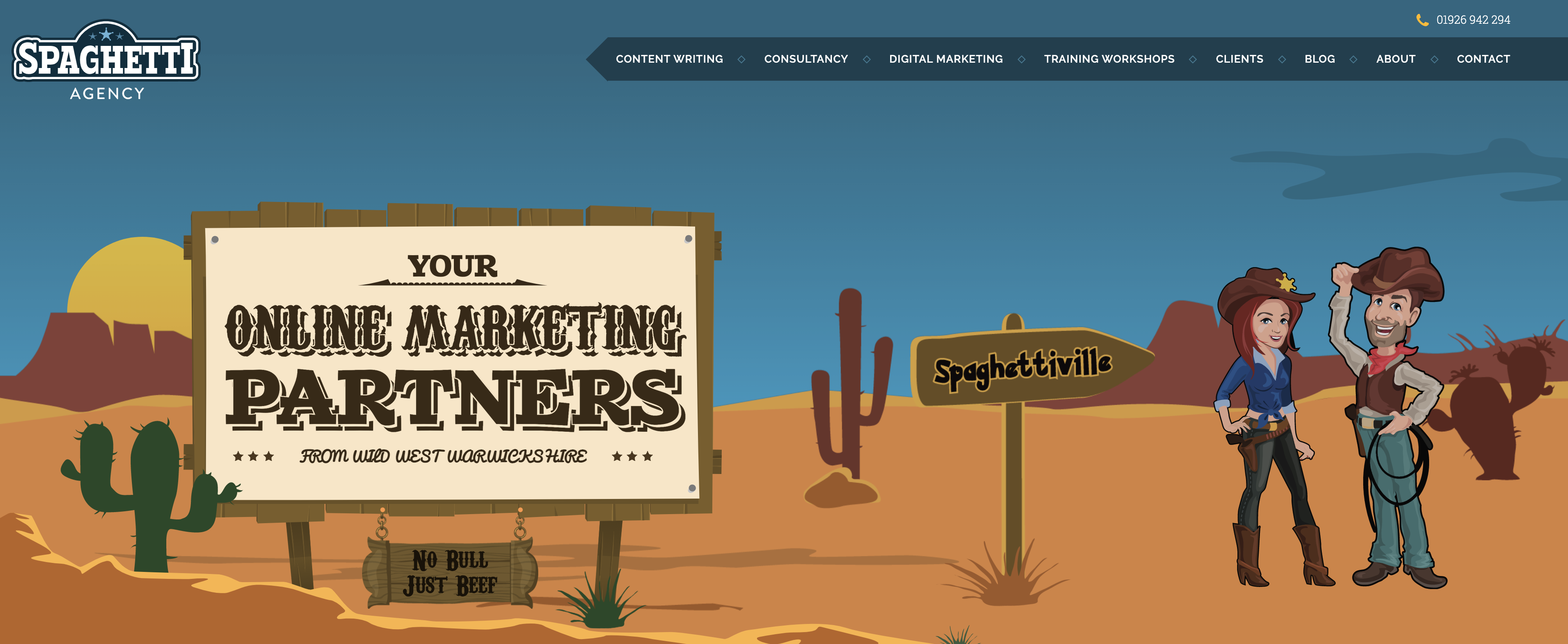
Take a look at the Spaghetti homepage – you instantly see ‘Your Online Marketing Partners from Wild West Warwickshire,’ so, you know who we are and what we do (and where), immediately. And if you want to know how we can help, you only need to look briefly at the rest of the page.
Clear branding
We’ll stop rambling on about ourselves soon, but there’s no mistaking the Spaghetti Agency branding. It’s inviting, playful, and unlike anything you’ve seen anywhere else. How can you make yours stand out, as well?
And it needs to be consistent. The branding on your homepage should be carried out through your entire website, and all of your social media channels. Don’t do it yourself, unless you’re a branding and design specialist.
Call To Action (CTA)
This is something that should appear prominently throughout your entire website. It reveals exactly what visitors need to do if they want to go a step further and enquire, get a quote, or buy something. Make sure it’s loud, proud, and always within the upper third of each page.
When it comes to the copy you’ll need for your home page, it’s quite simple:
- tell your audience what your business does and who you help;
- put the biggest benefit you can offer (ie. your key value proposition) front and centre;
- reveal how your business is different and far more beneficial for customers than the competition;
- help visitors find their way around the website; and
- show your business’s personality and values.
However, while the homepage might be the hub of your website, it is still important to pay attention to the rest of it.
So which other pages do you need, and how do you create them?
About Us Page – It’s not really about you

Somewhat surprisingly, the About page is often the second most visited page on a website!
The About page is key for visitors who want to know a bit more about you and what type of business you’re running, which is why this page plays such an important role in establishing trust between your brand and your visitors.
Don’t try and be quirky and call this page something else. Visitors expect to see the About page, so give them what they’re looking for rather than confusing them.
Ideally, a good About Us page should include a brief summary of who you are, the faces behind the company, your core values, and what differentiates your company from everyone else. But remember that readers don’t really care about you at this point – they care about you in the context of how you can help them get what they want.
So, make sure you’re keeping them front and centre, even on the About page. Ask yourself what it all means to your potential clients, rather than rambling too long about how you were founded in 1978 and you like dogs.
When knuckling down to write the copy for your about page, ask yourself these questions:
- How did it all start? What’s your story?
- What do people want to know about you?
- How do you help them?
- Why should people trust you?
- Why do you get out of bed each morning? (If this relates to something not selfish like setting yourself up for financial freedom. It’s fine, but probably not something to share here.)
- What are your core values?
- What does all of this mean for your customers?
For example, if you’re a website design company, you’ll want to get into the shoes of your existing clients and explain why they chose you. Is it because you don’t talk like a technical robot, and you explain things clearly? Is it because you’re aware that other web designers can finish a project then mysteriously vanish into thin air, never to be seen again, and you guarantee you won’t do that? Is it because you know that most customers don’t really understand about servers and hackers and you can take care of those things so they don’t need to worry about them?
Be specific, and show that you understand your clients’ problems and that you’re the one to fix them.
We’ve seen some cool examples of About Us pages over the years. We like to see a brief introduction to the company followed by a ‘Meet The Team’ section; we think it reveals that the people behind the business are the heart of the brand – above and beyond the history, awards, and brand values (although that stuff is important).
Products Page
Clearly, you only need this page if you sell physical (or intangible) products.
You might have one page which lists all your products, or you might have several categories in a dropdown bar (for instance, men’s clothing > accessories > watches). Either way, the same information and ‘must-haves’ apply to each page.
First and foremost, you need an outline of the products you offer. Alongside each product, give a brief and succinct description of its benefits first, and on each individual product page, you can provide more detailed information, such as product specifications and features.
Copywriting for product pages is all about telling great stories.
Here’s some pointers to get your creative juices flowing:
- What problems do visitors to your website have that you can solve?
- How can you solve their problems?
- What do they need to do to gain access to your product?
- How will your product change their life?
- Why is the product different from the competition’s?
- What single defining feature will deliver the biggest bang-for-buck?
Don’t forget to integrate reviews into each product page, too. This is another pivotal trust factor that often makes the difference when converting your potential prospects into customers.
Services Page
This page is only relevant to those offering services, like we do at Spaghetti Agency.
Services pages are usually more in-depth when it comes to content than product pages. This is because you’re not selling a physical product where you can add photos of the item to really draw visitors in.
Services have to be sold to the reader in an entirely different way, which is why the first point in the following list is of paramount importance:
Content – Why do people need your service? What pain does it solve? What question does it answer? For which deep-rooted problem does it really deliver a solution? Once again, focus your content entirely on what’s in it for the visitor. Get straight to the point and reveal why your service will have a measurably positive impact on their life.
Testimonials – Testimonials from previous clients are the services equivalent of product reviews. To sprinkle some more trust onto this page, add the name and company of the individual who provided the review. Written reviews are fine, but if you can grab a video testimonial – all the better.
CTA – This is an essential component for the services page. Most services are provided on a booking basis, whether that’s undertaken online or via the phone – there’s rarely a basket into which the service can be added. So, make sure the starting process for that booking is provided via a clear CTA that appears on every page.
If you offer extensive services, then you might want to consider having different sections for each service. Our website is a good example of this…

As a digital marketing agency, we offer a variety of different services, so we felt this was the best way to lay them out. This might change soon.
But if you prefer to go for a more minimalist menu design, you could simply have a drop-down box from your navigation bar for ‘Services’, although if you offer a lot of services this might start to look overcrowded.
Blog Page
Ahh, blog pages. The section of a website that’s often left to gather digital dust.
Not many business owners bother with blogging (that’s understandable – who has the time for it?). But blogs are super important.
Why?
Because Google bloomin’ loves them.
Why?
Because they are jam-packed full of fruity, relevant, consistent content.
This is your biggest opportunity to apply SEO practices in the form of keywords. Blogs allow you to throw a tonne of valuable content onto your website that the Google bots will eat up and use to help direct much needed organic traffic your way!
Blogs don’t have to be War & Peace, either. You just need to write interesting, helpful articles which provide actionable advice for the audience.
The good news is that we’ve got a fair bit of information on how to do that, below:
How to create a blog that improves your SEO: a step-by-step guide
A really simple way to improve your website’s SEO with blogging
How a blog benefits your small business
Contact Page
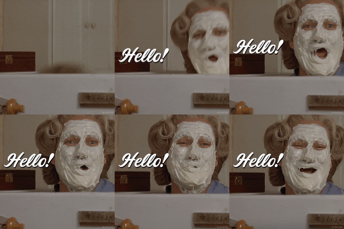
Now you might not think there’s much to the contact page. Most people don’t; they just throw in a phone number, email address, the office address, and assume Bob’s your uncle.
But this is only half of it. Remember – the user visits this page because they need help or want to get in touch. So, if you really care – make it easy for them!
Your website will have spent a considerable amount of time attempting to convert a visitor, so imagine if all that effort went to waste if they reach the contact page and decide to head elsewhere.
For this reason, it’s important to keep the contact page clean and simple, and without a single hurdle in sight.
Here’s a great bunch of examples of contact pages, put together by BlueLeadz.
This is what your contact page needs:
- A form – You need a form that is easy for the customer to fill in – Ask for their name, email and their message. You don’t need to know the name of their cat or their inside leg measurement. The more boxes there are, the fewer people will complete the form.
- Contact details – Your phone number, physical address, email addresses, and social media links.
- Opening hours – vital if you’re running a bricks-and-mortar business.
- Privacy page – This is very important, and there are plenty of templates from which to base yours.
- Terms & conditions – Again, there are plenty of templates out there, but you may need the help of a professional to get the specifics about your business and services right.
- Sitemap Page – A sitemap simply lists all other pages on your website.It can be used in two formats, XML and HTML. The XML version is essential because it allows the search engine bots to analyse pages on your website more easily and therefore enables them to determine a better SEO score. If you don’t have this, your search engine rankings might be negatively impacted.
A HTML sitemap isn’t essential, but it’s definitely worth having. Designed for your visitors, the HTML sitemap will provide a simple, digestible version of your sitemap – usually in list form.
Here’s a random example of a full sitemap: https://www.smartfares.com/sitemap.html. You can also add shorter versions of the sitemap to your footer if you wish (a very common tactic).
Don’t worry; it’s not something you have to manually create, either. If you’re using WordPress there are a ton of plugins that’ll help you to automatically create a great sitemap for your website.
404 Page
The 404 page is otherwise known as an ‘error page’ or a ‘page not found’ page. This is when the main domain of your URL has been reached but the path/slug (the bit after the domain) is incorrect, doesn’t exist, or the page has been unpublished. Basically, whatever you were expecting to see isn’t there!
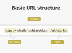
A 404 page is simple; all you need is to explain that the visitor has reached a broken page and ensure you offer a redirect back to the homepage. It’s also a fantastic opportunity to have a bit of a laugh with them and show your brand personality. This is why we see so many funny 404 pages, such as:

Have more questions?
We hope this has helped you to determine which pages you need on your website, and how to make the most of them.
If you think you need a helping hand, or you don’t have the time, knowledge, or energy to write your own website copy, just get in touch with the Spaghetti Agency team!
Tags associated with this article
Post a comment
We'd love to know what you think - please leave a comment!







0 comments on this article